Elevating brand communications while ensuring consistency throughout thousands of retail locations nationwide, I’ve devised multiple brand and retail-focused guidelines as well as typographic concentrated style guides that systemize the use of type across various core brand applications. Neue Haas Grotesk, the chosen display font, stands out as one of Verizon's most impactful visual elements. In a company where effective communication holds paramount importance, typography, embodied by Neue Haas Grotesk, plays a central role. This commitment to a purist and minimalist design philosophy has brought the font to life not only in Verizon's nationwide stores but has also solidified its position as one of the brand's foremost assets.
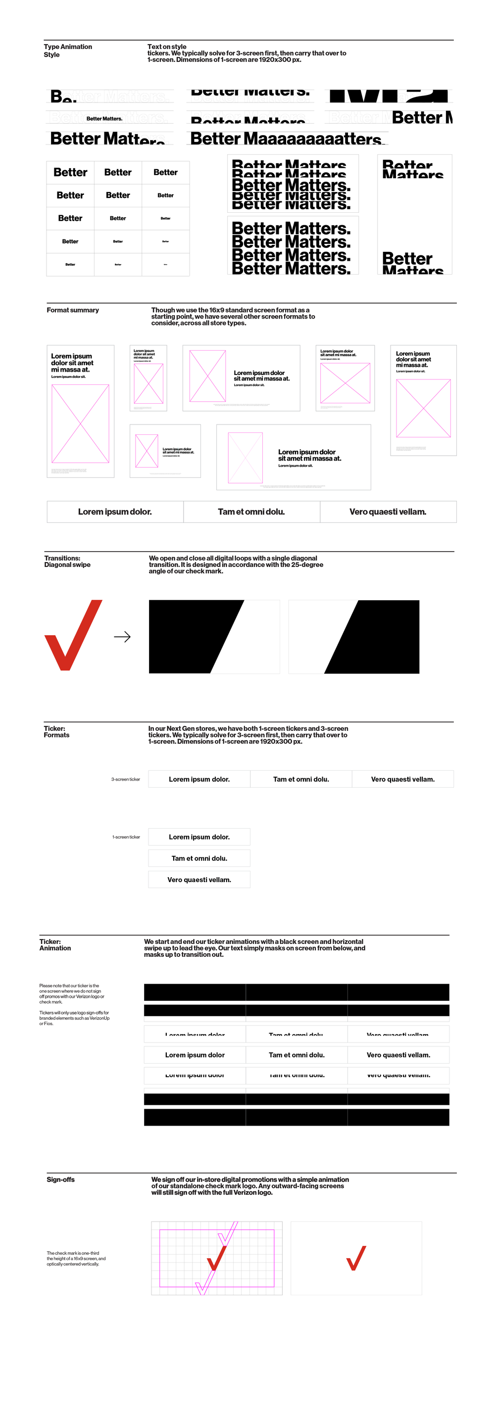
Within the digital space, it enables experimentation with scale, speed, repetition, and various other animations that reflect Verizon’s clear mission of optimal communication and intelligent business.