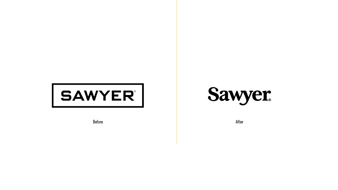
In 2021, Sawyer aimed to initiate a rebranding effort, starting with developing a simple logo—a wordmark that embodies the brand's purpose and origin. Sawyer is a family-owned brand with a fundamental mission guided by a commitment to social responsibility and environmental stewardship, ensuring everyone has access to clean and safe drinking water.
The brand's name draws inspiration from Tom Sawyer's Adventures of Huckleberry Finn. Intrigued by this connection, I decided to dig into the book's history starting with the first print, and discovered that the font used was Baskerville. Once exploring this classic typeface I realized an opportunity to capture and represent the essence of the brands purpose with a single drop of water.