


1
2
3
4
5
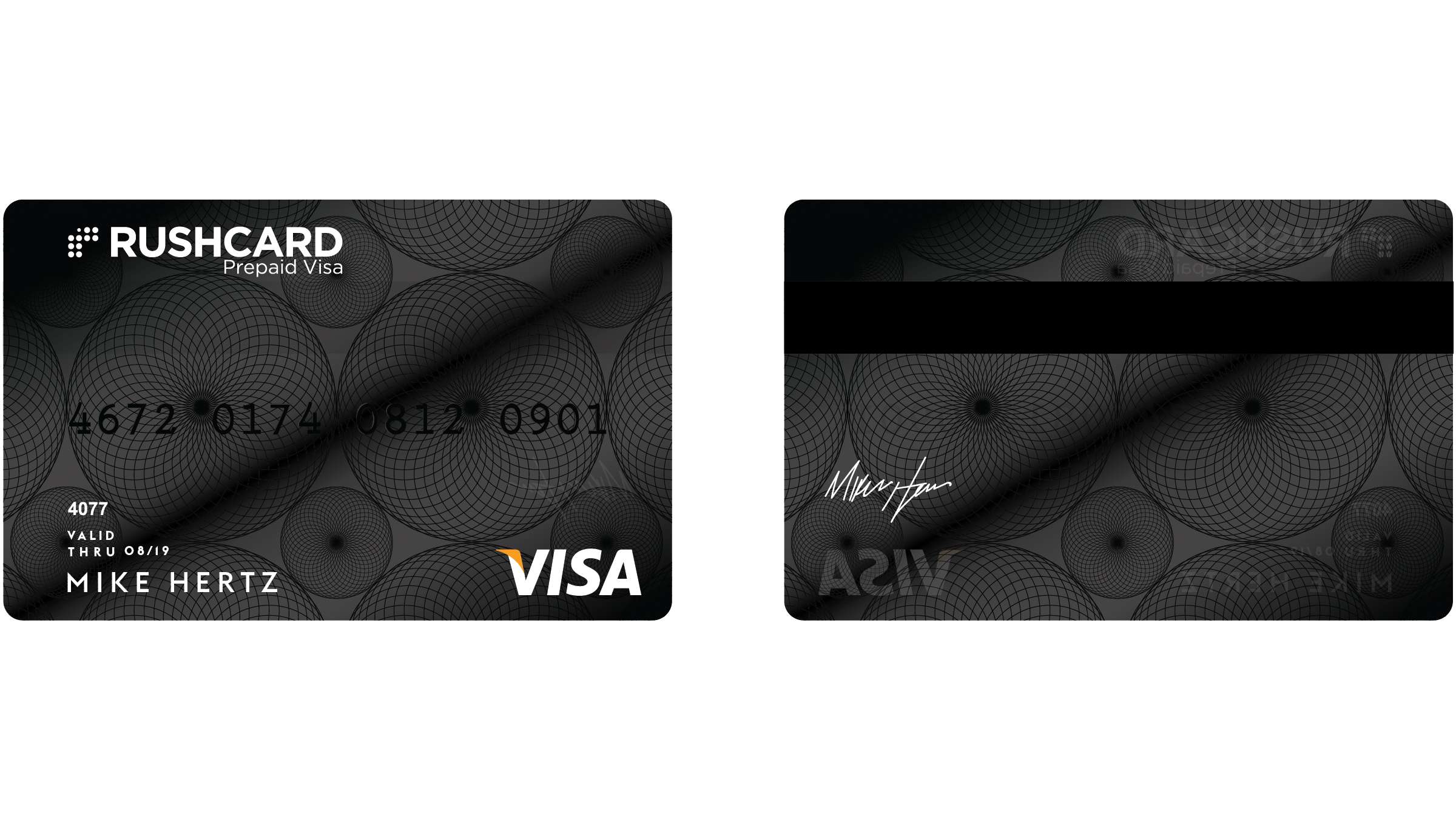
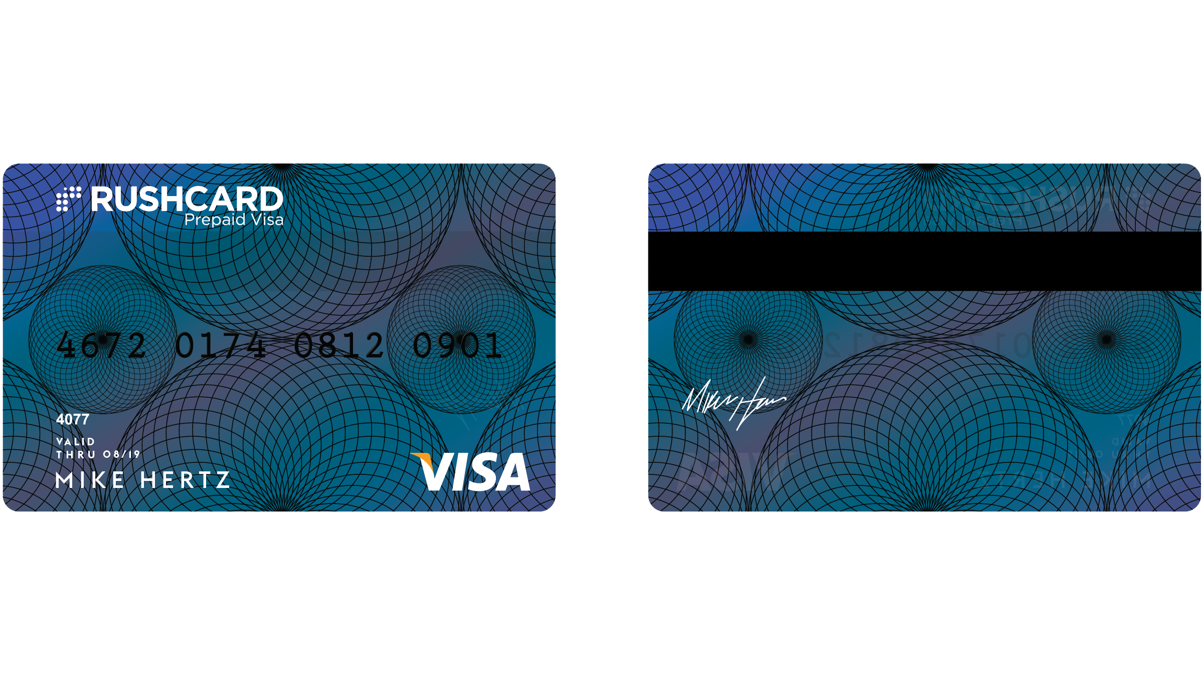
My role as a Senior Designer was to visually interpret the evolved RushCard story. The first challenge was to develop a new visual identity for rush card’s prepaid cards. The idea was to create a harmonic pattern that perpetuates the concept of financial growth and opportunity. Using the brand's logo as inspiration, the dots quickly transformed into circular reverberations, that were then scaled to a tier system for various membership levels. The total series consists of 5 unique prepaid cards including, Standard, Made, Rise, Elite, and Premium.
Our second challenge was designing the physical card. Conveying the idea of financial security and growth while considering materiality. All cards are constructed of three layers, which include, transparent ink, flywire, and a gloss metal base.
Carlos Fig - CD
Colin Kim - ACD
Josh Stark - Copywriter
2015